Office of Brianna Geiger
Role
Brand Designer & Art Director
Brand Designer & Art Director
Scope
Brand Strategy • Visual Identity • Copywriting • Print • Out-of-home • Social
Brand Strategy • Visual Identity • Copywriting • Print • Out-of-home • Social
Project type
Client work
Client work
Brianna Geiger is a registered dietitian whose work is built around practical, individualized nutrition—not rules, guilt or one-size-fits-all wellness advice.
The identity needed to communicate credibility without looking like a medical practice, and personality without drifting into the usual wellness-brand territory of leaves, soft blues and vaguely healthy-looking stock photography.
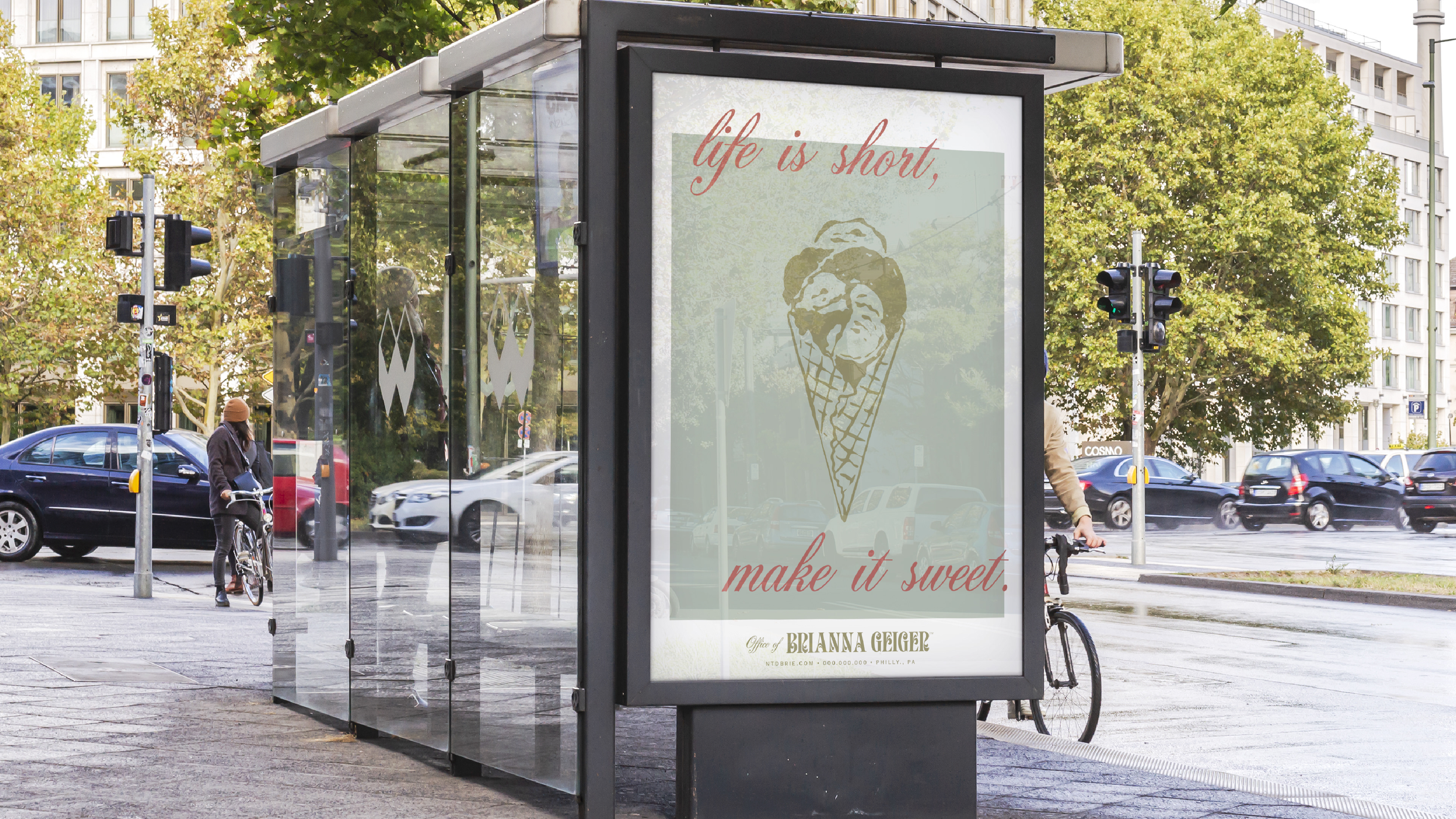
Healthy didn’t need to look healthy.
A lot of nutrition brands reach for the same visual shortcuts—corporate greens, basic leaves, stark fruit, clean sans-serifs and a lot of white space.
None of that really felt like Brianna.
Her approach is more candid and practical, so I wanted the identity to feel confident and considered without looking overly polished or clinical. That meant leaning into expressive typography, slightly unexpected color and imagery that treats food like something to enjoy, not something to fear.
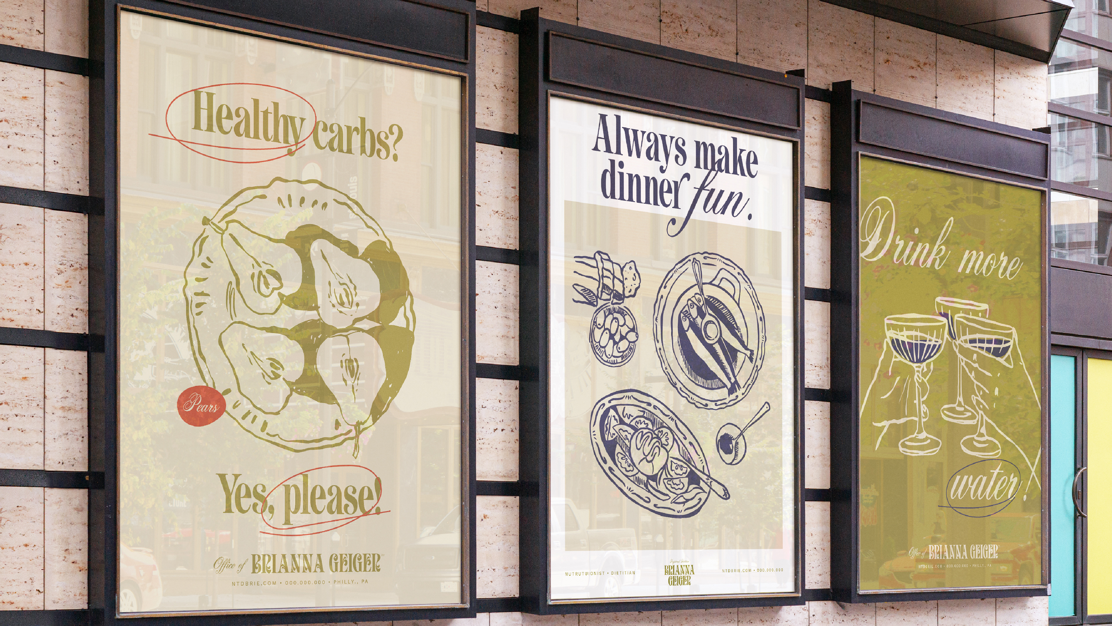
Food should still look like food.
The brand needed room to talk about nutrition without turning every touchpoint into a lesson.
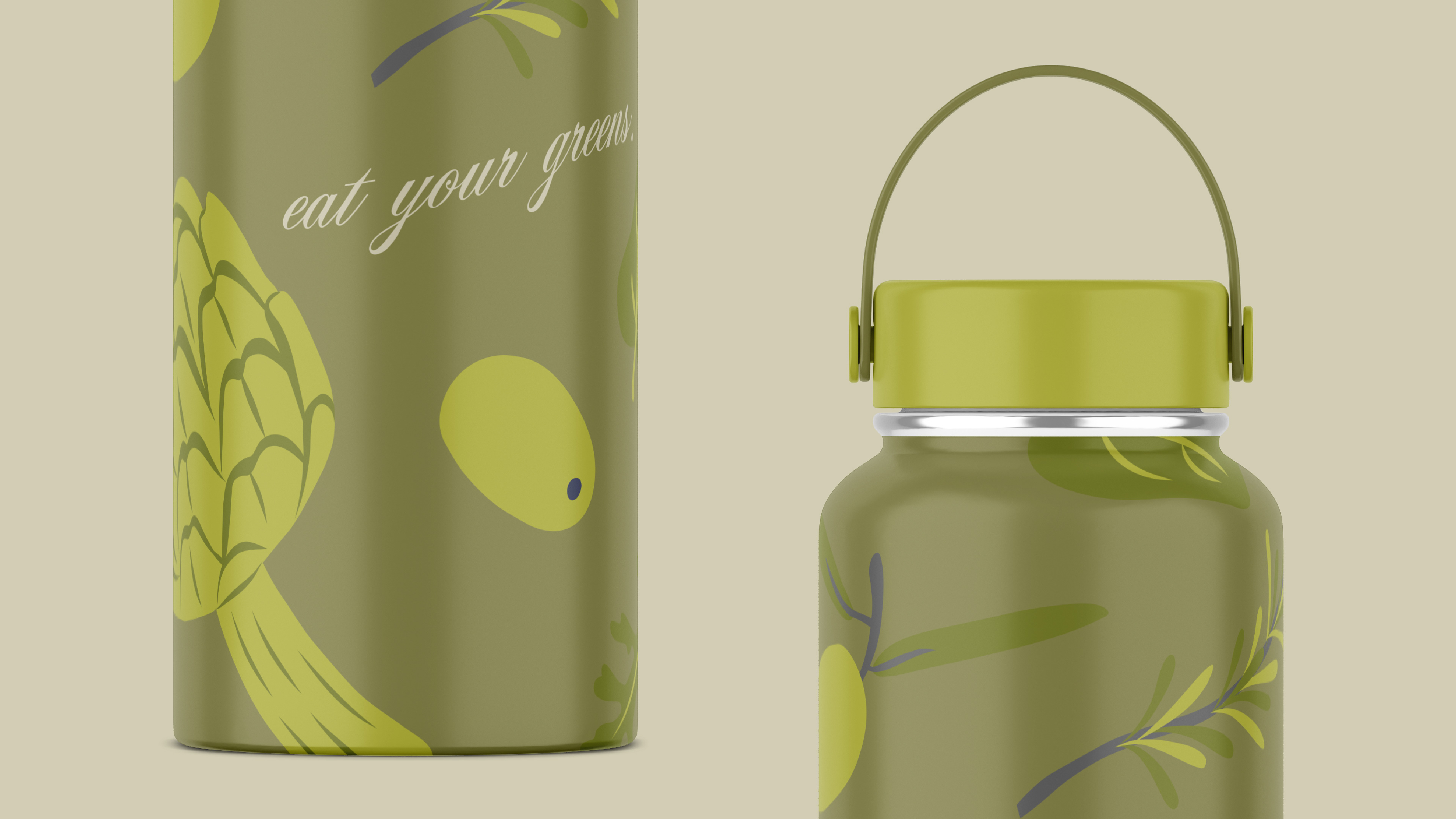
So the illustration and campaign work focuses on familiar foods, simple phrases and a little humor. Instead of treating food as something clinical, optimized or moralized, the identity treats it as part of everyday life.
That made the more expressive pieces—posters, social content and outdoor advertising—feel like an extension of Brianna’s point of view rather than a separate campaign system.
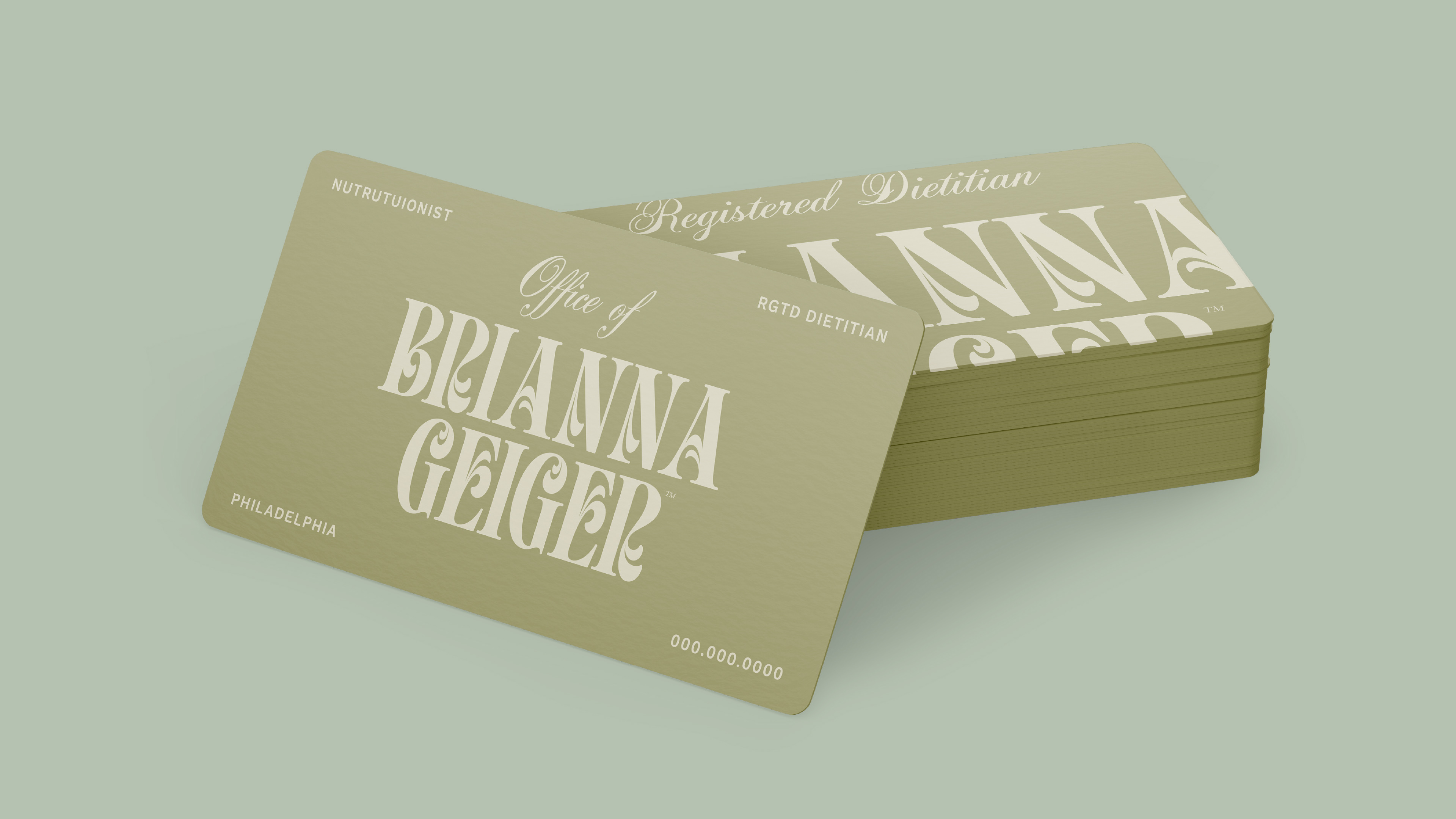
Personality is nice. Trust still matters.
For all the expressive pieces, this is still a healthcare-adjacent service built around trust.
That meant the identity had to settle down when it needed to.
Business cards, stationery and client-facing communications use the same visual language with much more restraint—keeping the typography, color and tone recognizable without forcing every application to be loud.
That contrast is important. The brand gets to have personality without making every moment about the brand.
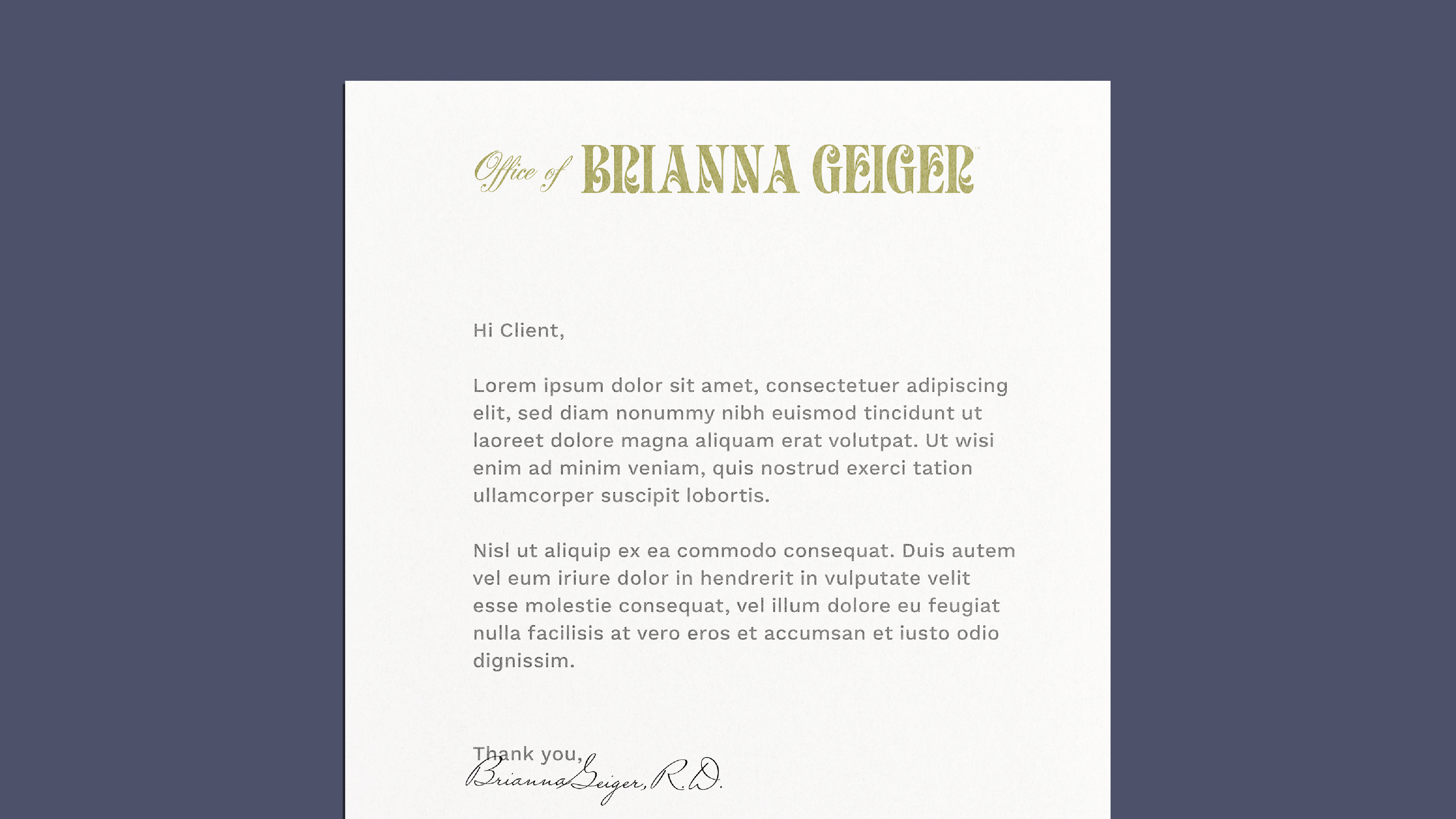
A little editorial. A little nostalgic.
The typography does most of the personality work.
A bold, expressive display face gives the identity a strong editorial quality while the supporting type keeps the more practical pieces clear and usable. The palette stays soft and natural, but not so neutral that the brand disappears.
I liked the tension between those two things: something polished enough to feel credible, but loose enough to feel personal.
That balance became the foundation for the rest of the system.
Credible without feeling clinical.
The finished identity gives Brianna room to be both things at once: a qualified healthcare professional and a real person with a point of view.
It feels informed without feeling institutional, expressive without losing trust and flexible enough to move between client materials, public-facing campaigns and everyday brand touchpoints.
That balance was the whole point.