Refreshing Chick-fil-A Supply
Role
Lead Creative Consultant
Lead Creative Consultant
Scope
Brand Design & Strategy • Visual Systems • Creative Direction • Brand Guidelines • Environmental Design • Digital Design • Motion Design
Brand Design & Strategy • Visual Systems • Creative Direction • Brand Guidelines • Environmental Design • Digital Design • Motion Design
Chick-fil-A Supply operates behind the scenes, supporting Chick-fil-A restaurants through a growing network of distribution centers, fleet operations and support teams.
As the business grew, the visual identity needed to grow with it. What had worked as a relatively small collection of brand assets now had to stretch across trucks, facilities, digital communications, apparel and a lot of things that hadn't been designed yet.
The goal wasn't to make Chick-fil-A Supply look less like Chick-fil-A. It was to give it enough of its own visual language to work like a brand in its own right.
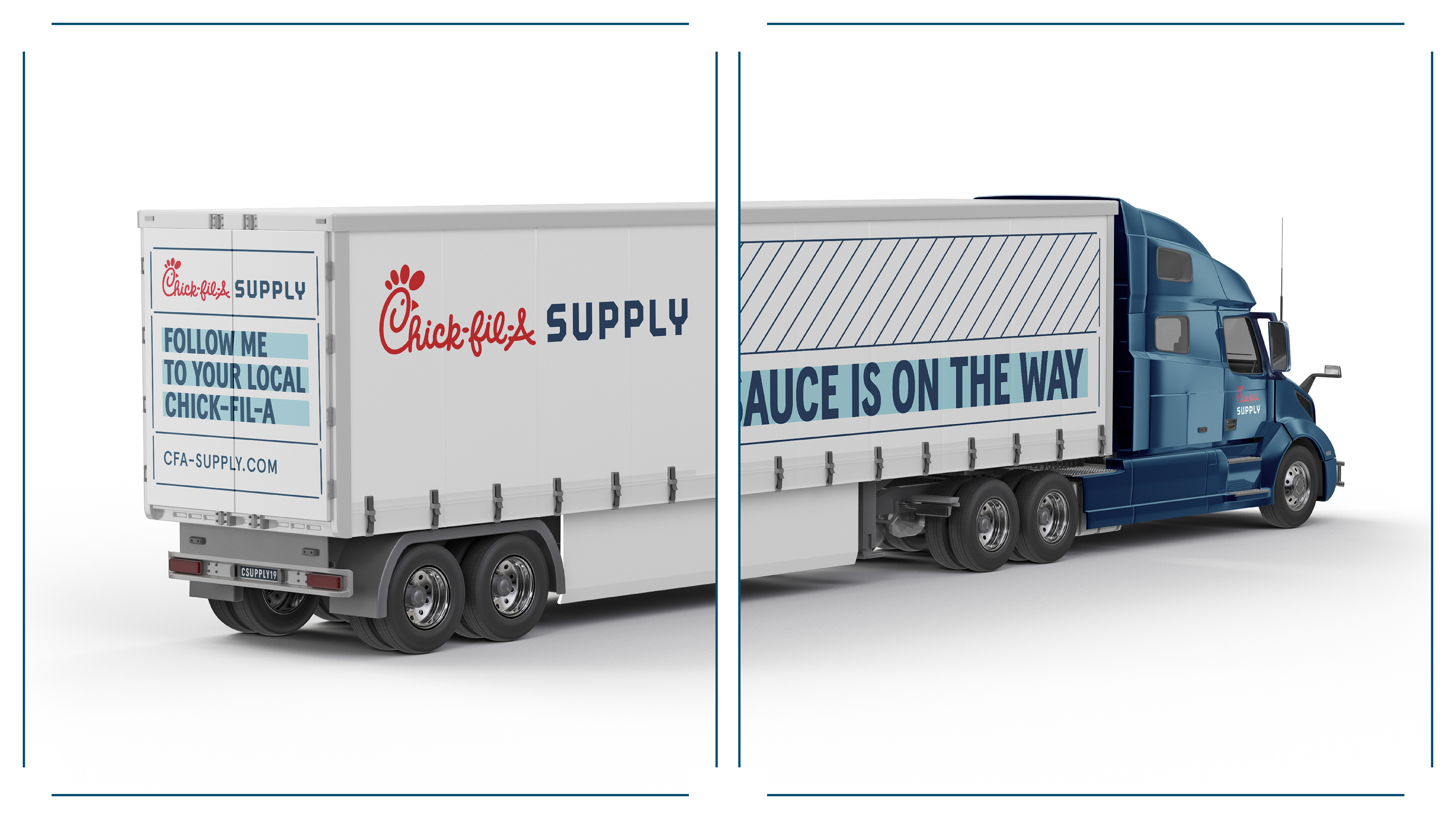
A LOT HAS TO HAPPEN BEFORE A CHICK-FIL-A RESTAURANT CAN SERVE A Customer.
Chick-fil-A Supply sits in a very different world from the restaurants guests know. There are warehouses, loading docks, delivery routes, safety requirements and operations moving constantly in the background.
That gave the identity an interesting job. It still needed to feel unmistakably connected to Chick-fil-A, but simply borrowing the restaurant brand's visual language wasn't enough. Chick-fil-A Supply needed something more direct, more operational and flexible enough to work at a completely different scale.
Working with Matchstic and Chick-fil-A brand partners, we started building that language around the parts of the brand that mattered most—and giving Chick-fil-A Supply more room to own them.
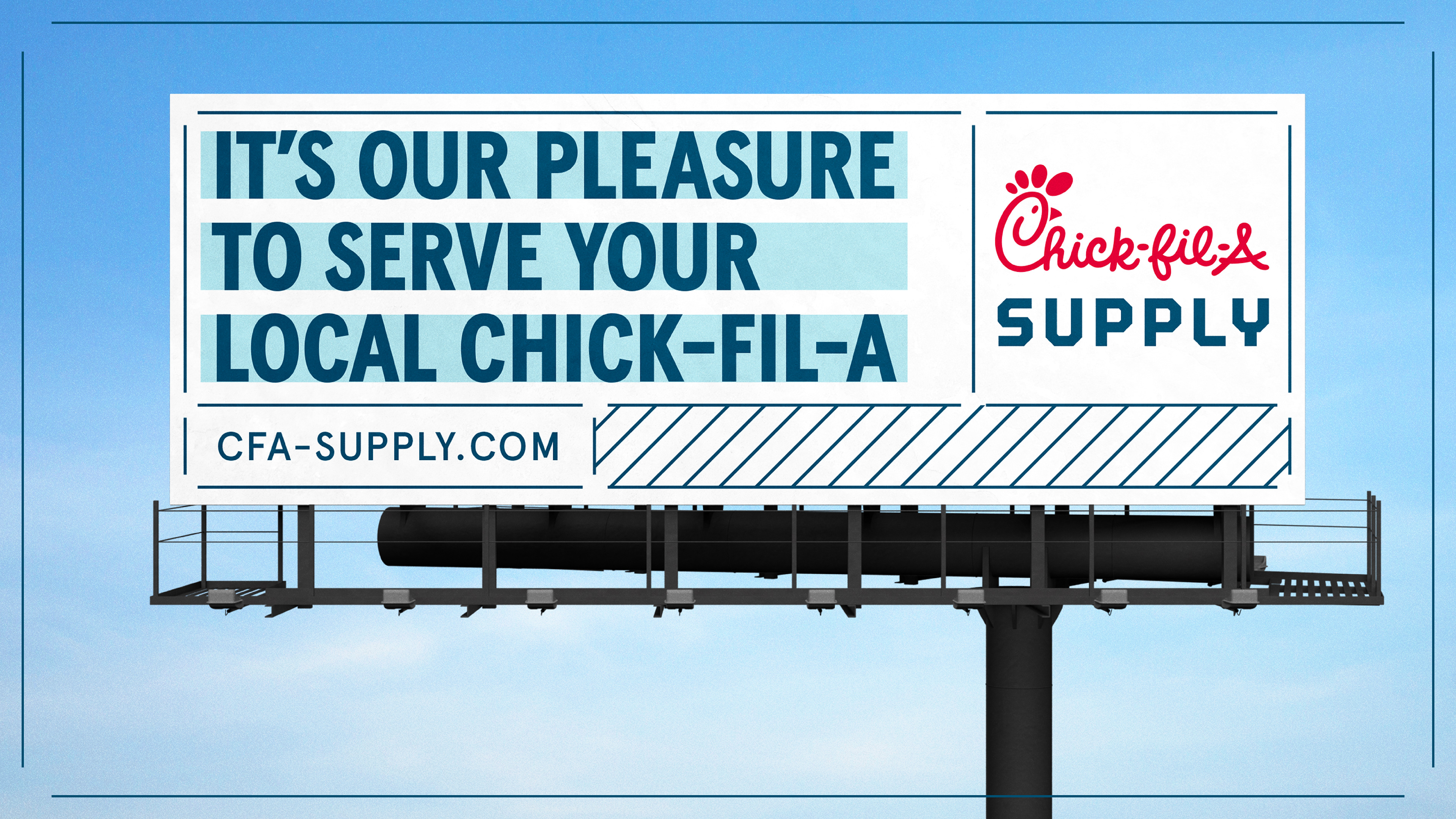
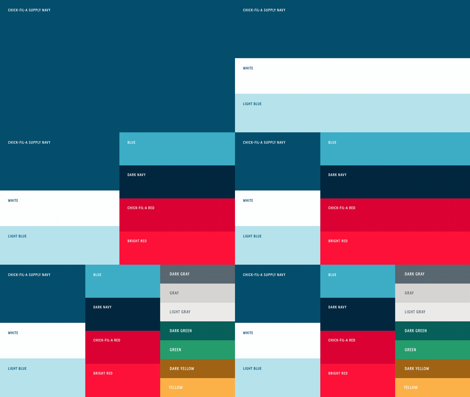
Hospitality, built for a warehouse.
One of the things I kept coming back to was that Supply couldn't suddenly become cold or overly industrial just because the work happens in warehouses and trucks.
It's still Chick-fil-A.
So the system balances both sides of the business. Navy brings structure and utility. Bold condensed typography gives communications the kind of visibility they need in operational environments. Lighter blues, graphic framing and moments of Chick-fil-A Red keep the identity from losing the warmth of the parent brand.
The result is more functional without feeling less human.
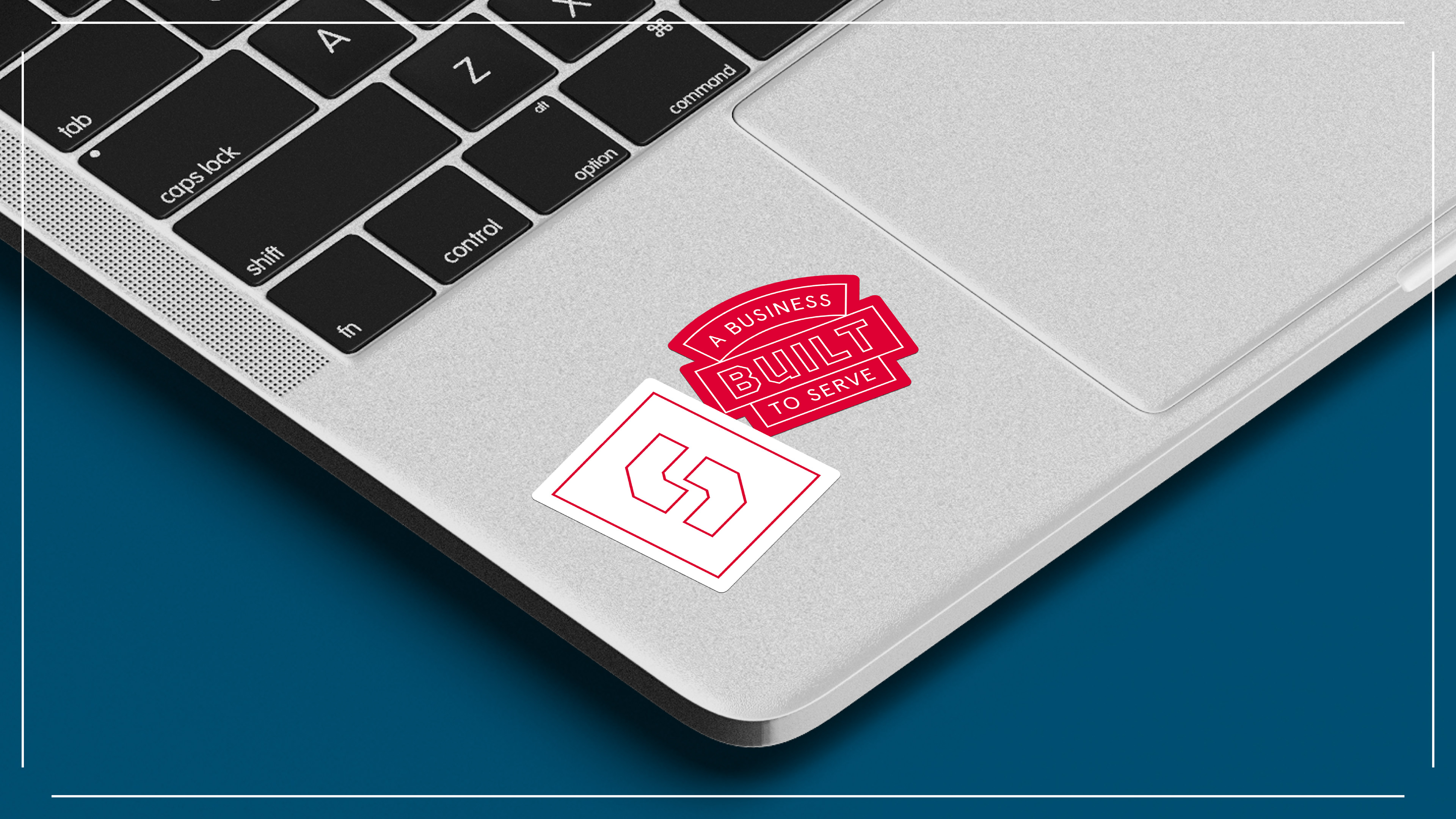
One system. A lot of places to put it.
Scale became one of the biggest tests of the identity.
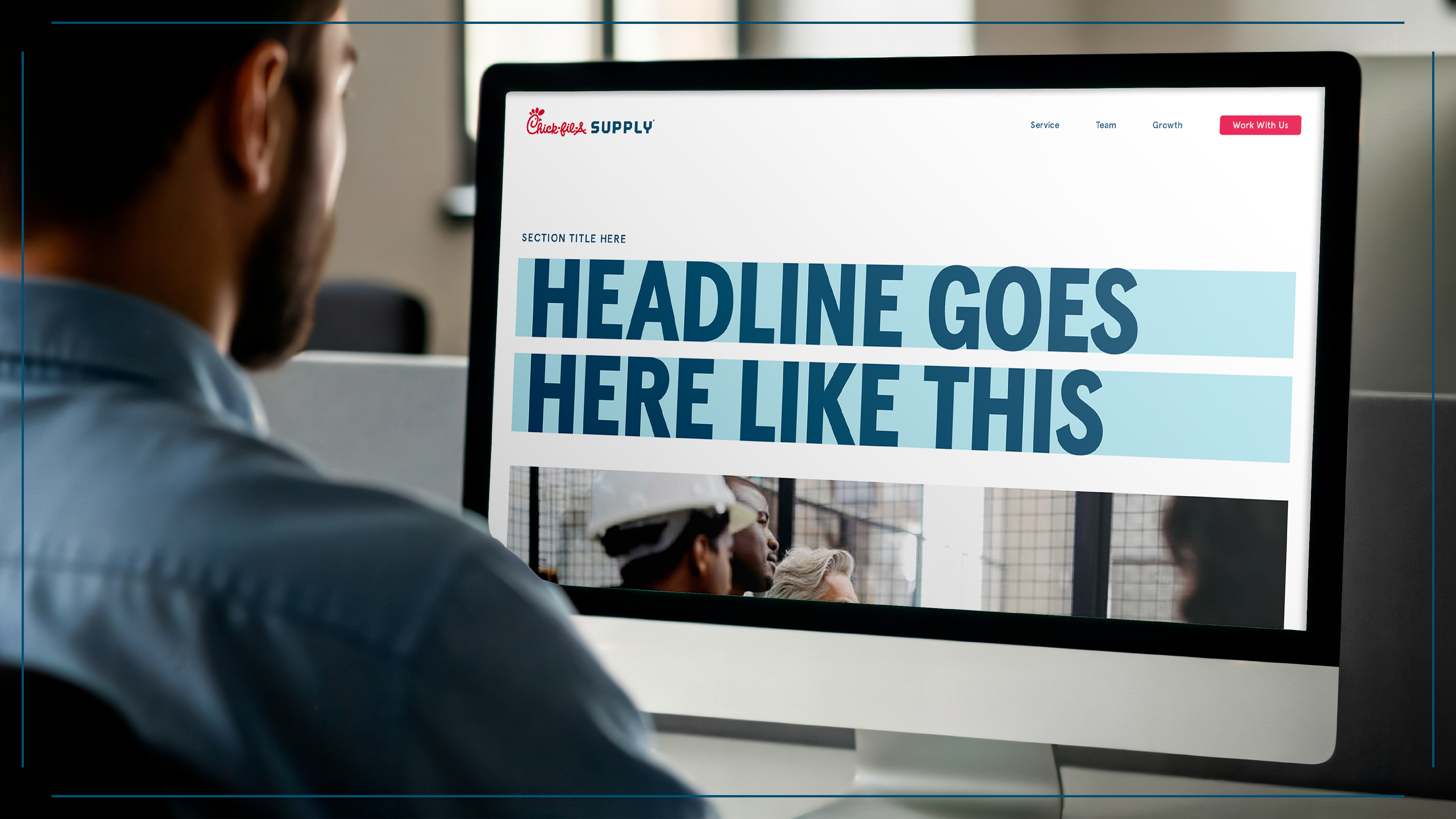
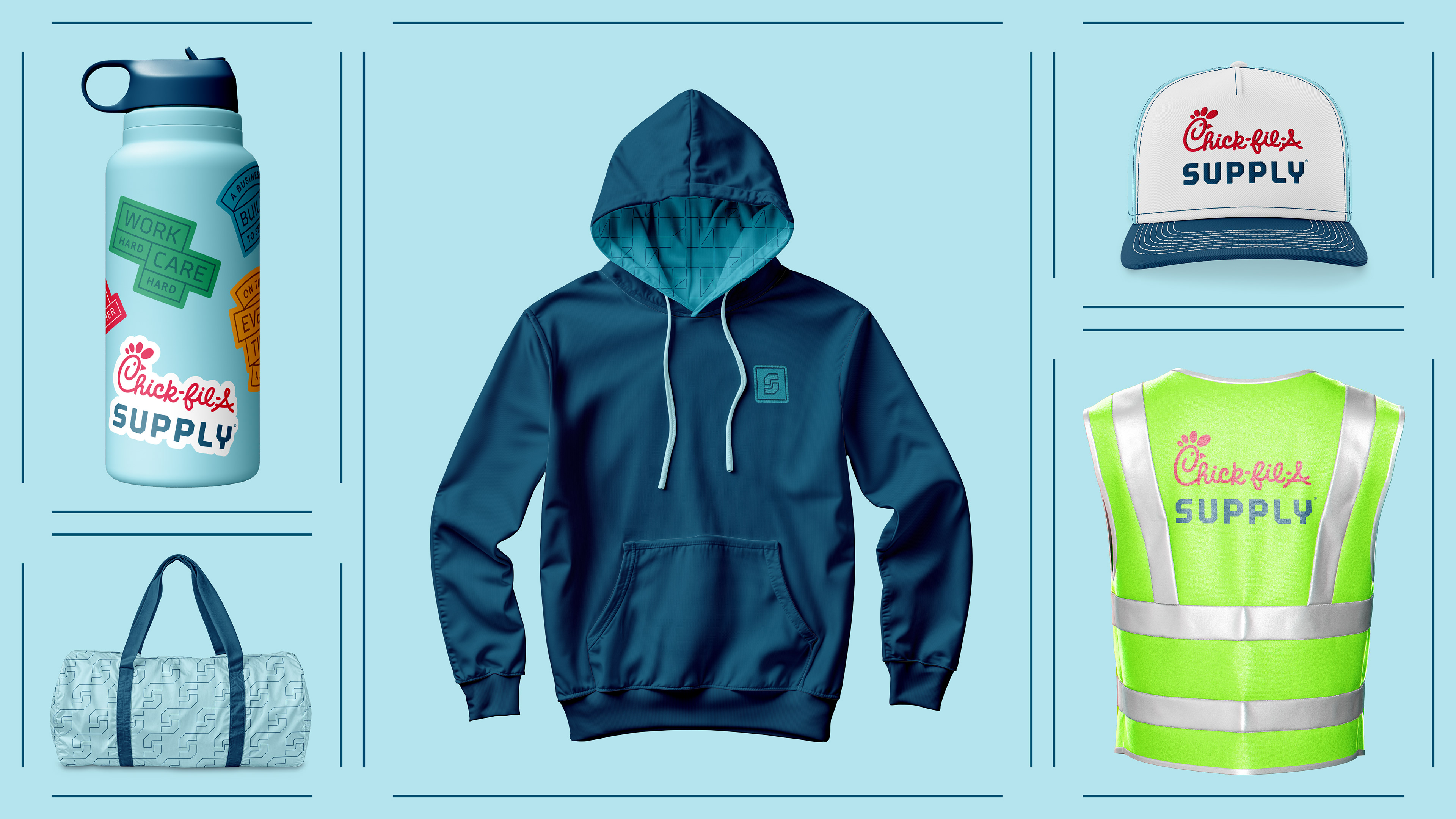
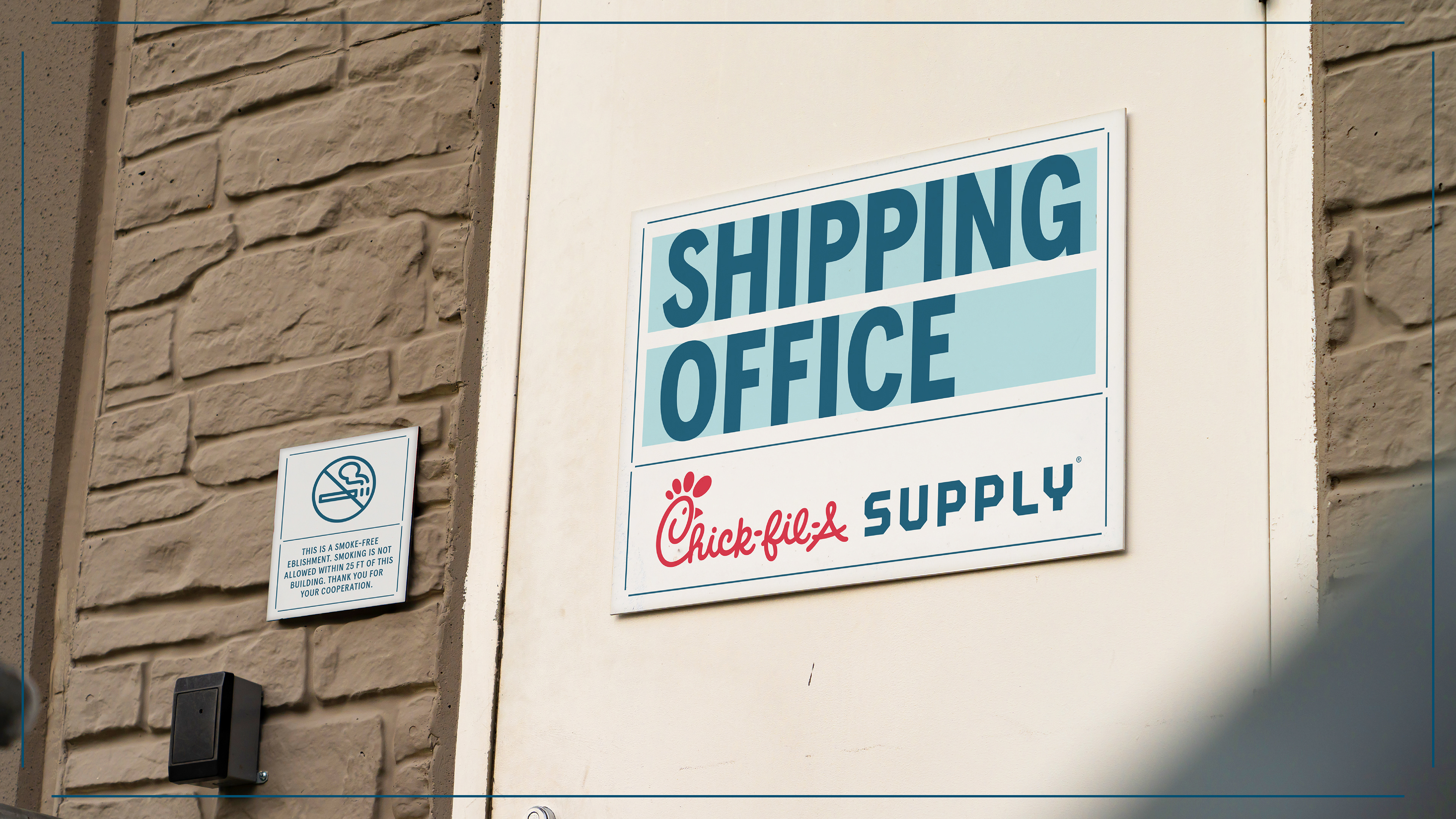
A message moving at highway speed has almost nothing in common with a website, a piece of employee apparel or a sign mounted outside a distribution center. Designing each of those as its own little world would have put us right back where we started.
Instead, the system gives all of them the same basic grammar—type, color, framing, hierarchy and a shared set of visual behaviors—then leaves enough room for the application to do what it needs to do.
A brand system isn't finished when the design is.
Making the work was only part of the job.
Chick-fil-A Supply's identity has to be used by internal teams, agency partners, vendors and people who will never be in the room where the original decisions were made. That means the rules have to be just as considered as the creative.
My role extended into documenting the system, building guidance and helping translate design decisions into something other teams could actually use—without turning every new application into a brand review from scratch.
Built to keep moving
Chick-fil-A Supply isn't a static business, so the identity couldn't be a static set of assets.
The finished system gives Supply enough structure to be recognizable across very different environments while leaving room for new teams, facilities, communications and ideas to become part of it.
For me, that's what made this project interesting. The work wasn't really about designing a truck, a website or a sign.
It was about building the visual language that lets all of them belong to the same caring brand.
All Content: ©Chick-fil-A Supply