Just Patchy
Role
Lead Designer
Lead Designer
Scope
Brand Strategy • Visual Identity • Character Design • Packaging • Apparel • Digital Design • Retail Collateral
Brand Strategy • Visual Identity • Character Design • Packaging • Apparel • Digital Design • Retail Collateral
Project type
Client work
Client work
Just Patchy is built around a pretty simple idea: kids should get a say in what they wear.
The brand turns everyday apparel into something more personal through mix-and-match patches, giving kids and parents a way to customize clothing without making the experience feel complicated or overly precious.
The identity needed to work the same way—colorful, flexible and full of personality, but organized enough to grow into a real retail system.

The brand had to feel customizable too.
The product is all about choosing pieces, moving them around and making something your own, so a rigid identity never really made sense.
I wanted the brand to feel assembled in the same way the clothing is.
The chunky letterforms, stitched outlines and character shapes all feel like pieces that could have been picked up, rearranged and attached by hand. Nothing is too polished. Nothing is too perfect. That little bit of imperfection is what keeps it feeling playful.
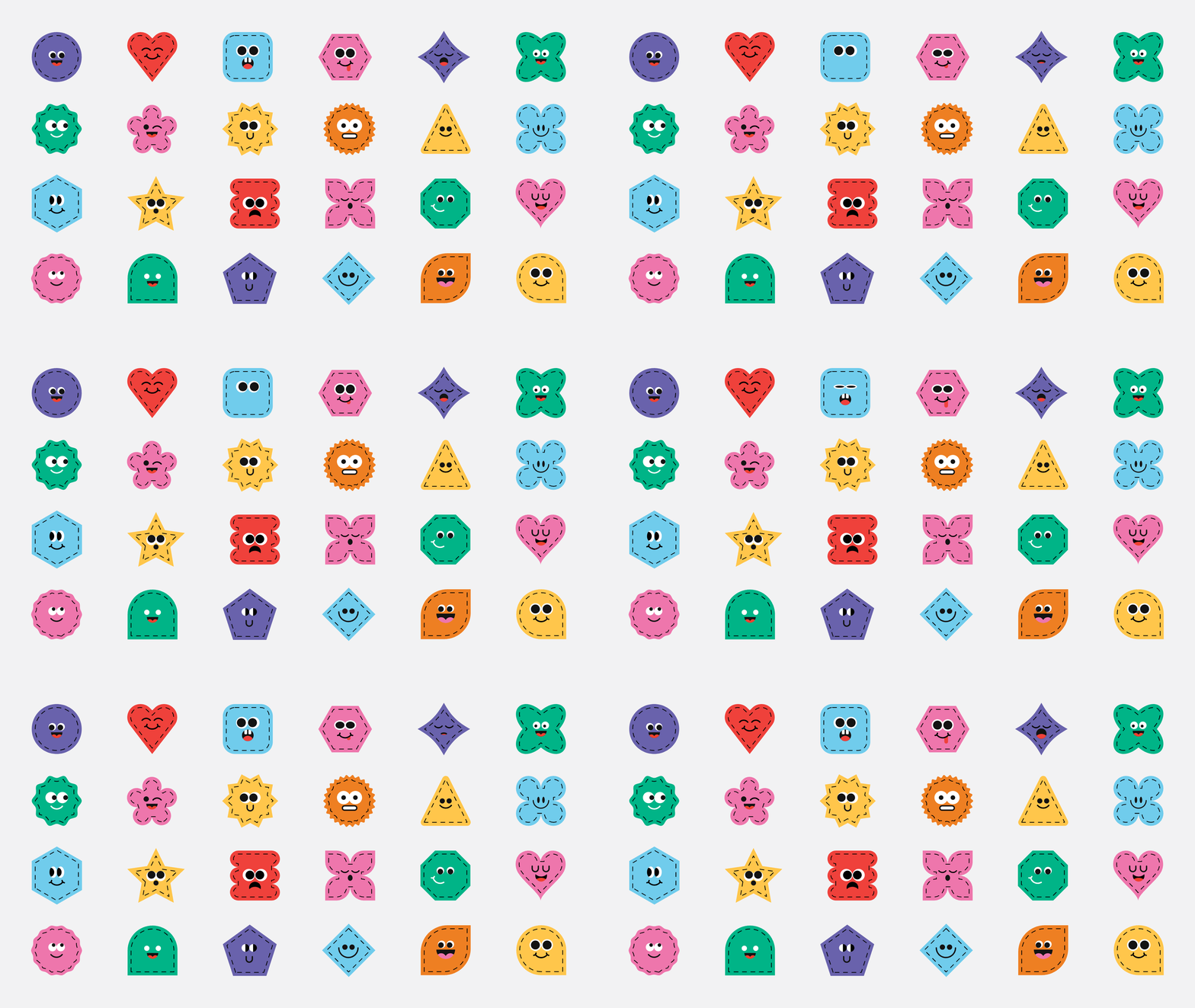
A whole cast of patch bugs
Rather than build the identity around a single mascot, I created a whole family of characters from simple geometric shapes.
Each one follows the same basic rules—bold color, stitched borders, simple faces and exaggerated expressions—but they all have enough variation to feel different from one another.
That gave the brand something much more useful than a mascot. It created a library that could keep growing, show up individually or work together as a larger pattern, collection or storytelling tool.
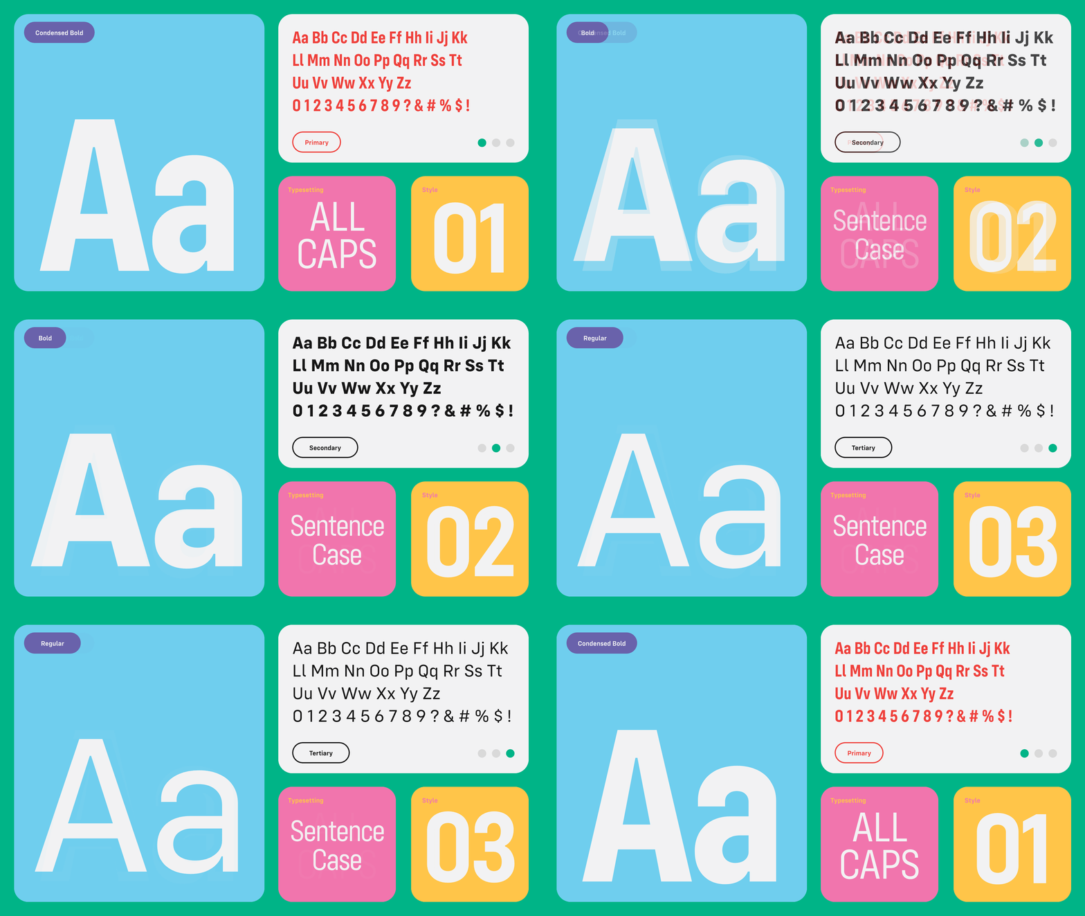
Kids get the fun
A children’s brand can get noisy pretty fast.
The characters and color were already doing plenty of the expressive work, so the rest of the system needed some structure. A bold condensed typeface keeps product names, sizing and retail information clear while the broader palette gives the brand enough variety to stay playful without every application turning into visual chaos.
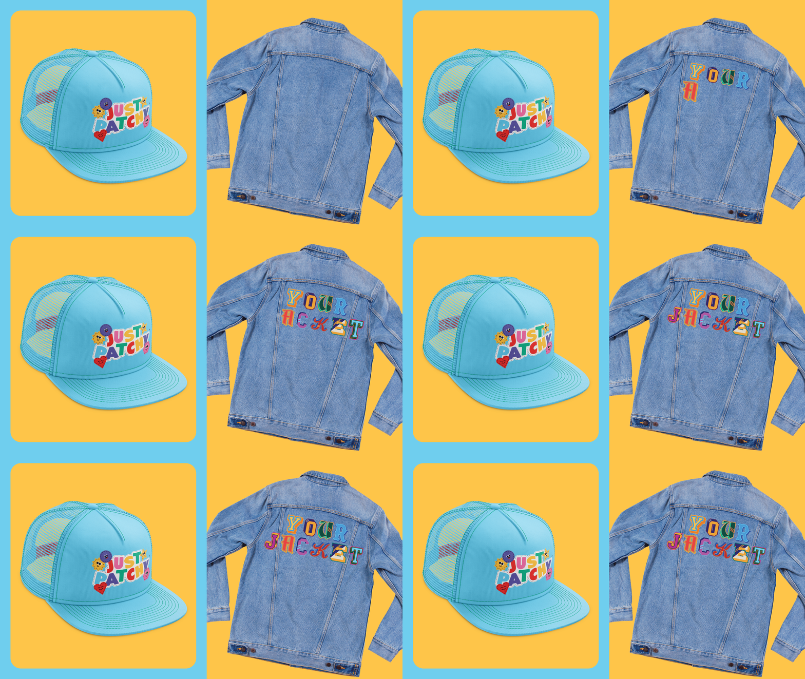
Cute is easy. Making cute actually work is harder.
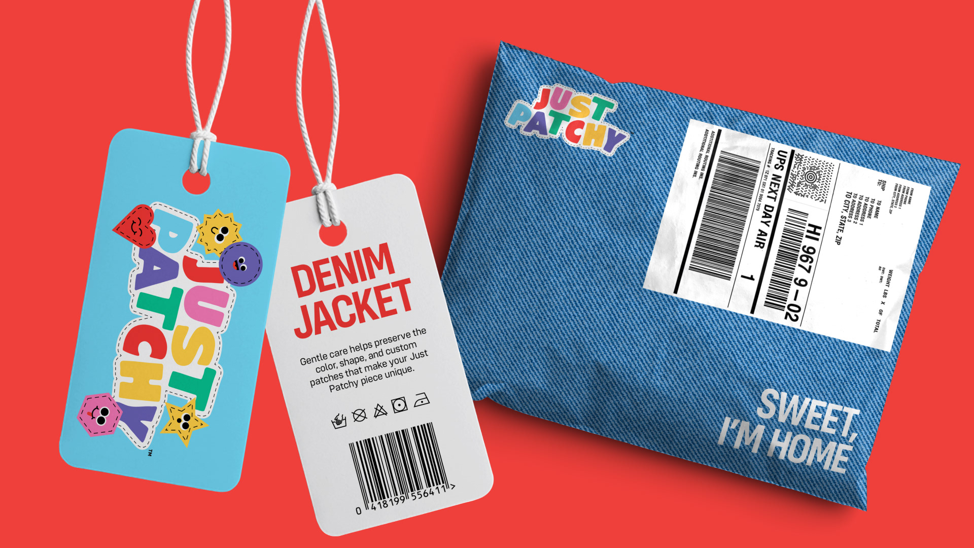
A logo can look great on a presentation slide and completely fall apart once it hits a hangtag, shipping label or tiny embroidered patch.
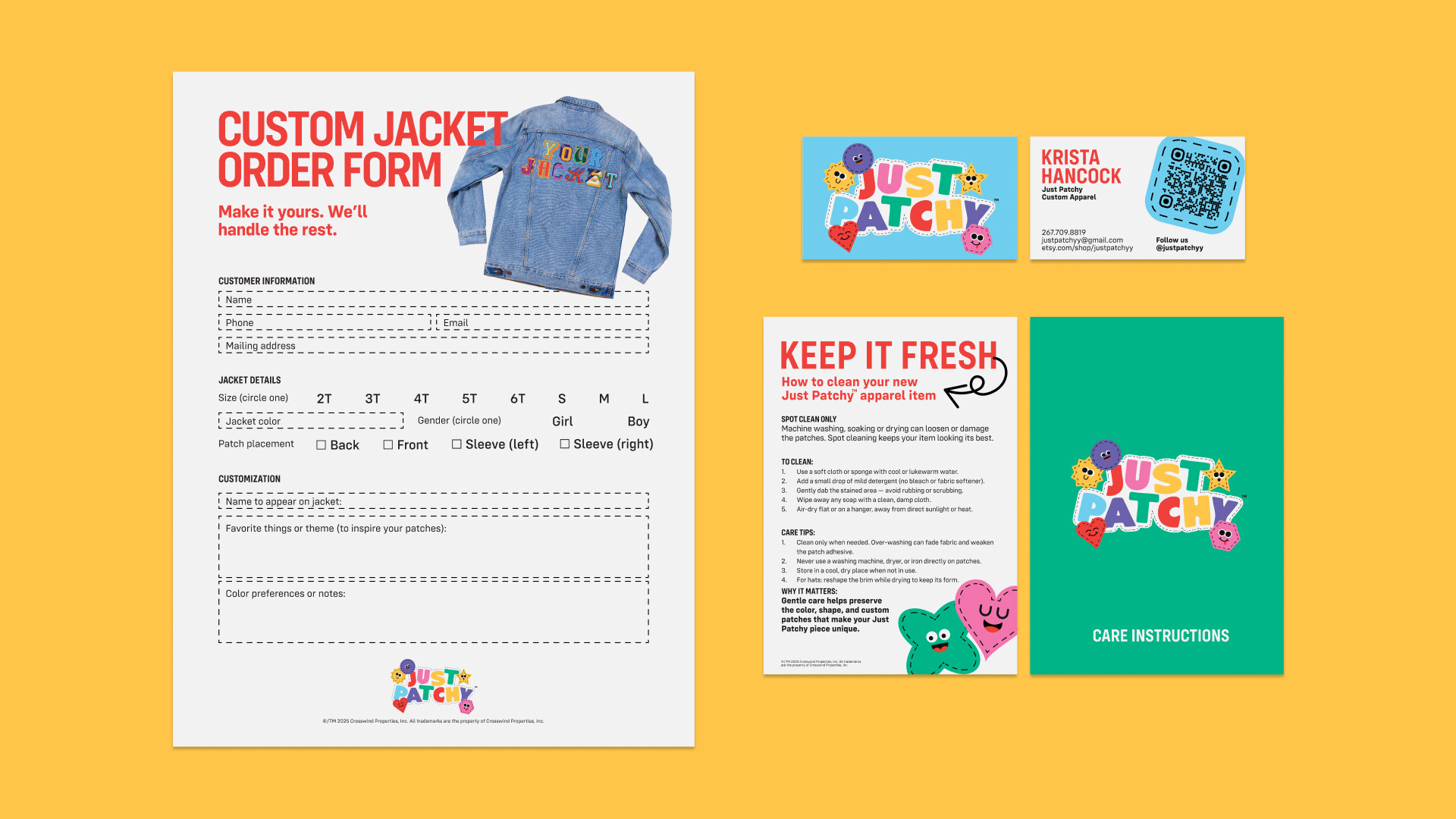
So I treated the everyday retail pieces as part of the identity from the start.
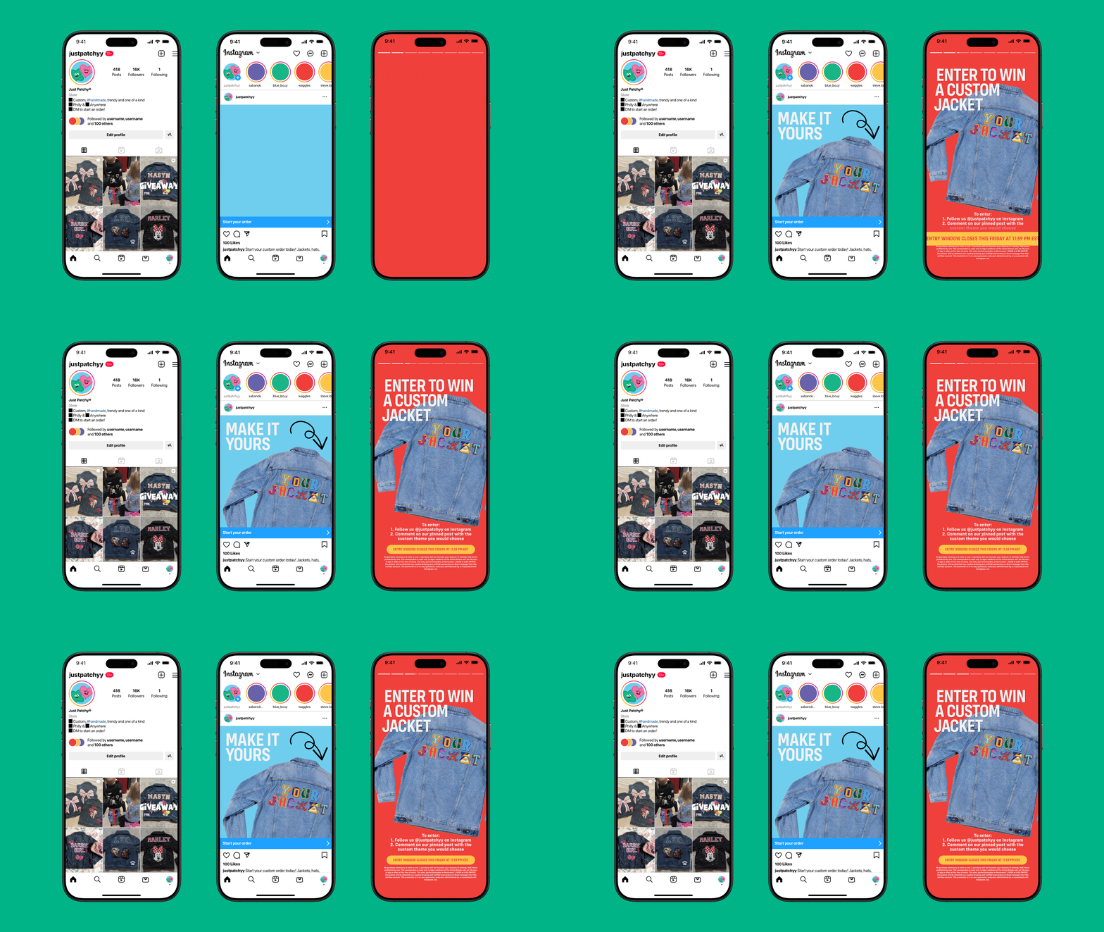
The same visual language had to work across apparel, packaging, ecommerce, social content, order forms and all the slightly less glamorous things a real brand still needs to function.
Made to keep changing.
Just Patchy works best when it doesn’t look exactly the same every time.
Different colors, different characters and different combinations are part of the point. What holds it together is the shared set of rules underneath all of that variation.
That gives the brand room to grow with new patches, products and personalities without having to reinvent itself every time something new gets added.
For a brand about making things your own, that flexibility felt pretty important.