Jake’s Coastal Cantina
Role
Brand Designer & Art Director
Brand Designer & Art Director
Scope
Brand Strategy • Visual Identity • Logo Design • Typography & Color • Packaging • Menu Design • Environmental Design • Uniforms • Out-of-Home
Brand Strategy • Visual Identity • Logo Design • Typography & Color • Packaging • Menu Design • Environmental Design • Uniforms • Out-of-Home
Jake's Coastal Cantina is a fast-casual Mexican restaurant in Indian Rocks Beach, Florida—just a few blocks from the Gulf and right in the middle of a crowded little beach-town restaurant scene.
The food had personality. The location definitely had personality. The brand? It was relying pretty heavily on stock graphics and disconnected pieces that didn't give Jake's much to call its own.
So I gave it some.
The surfboard wasn’t the problem.
My first instinct was to get rid of it.
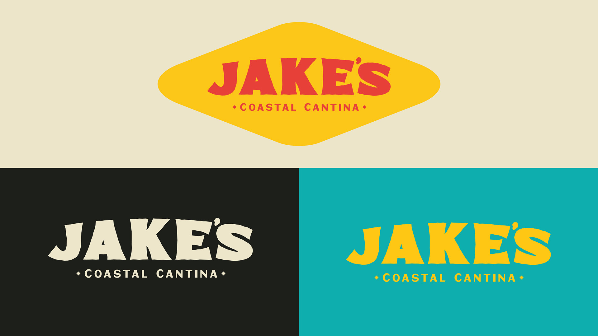
Jake’s had been using a surfboard-shaped logo for years, and visually it was one of the most obvious pieces of the old identity. But the more I worked through the refresh, the more I realized the surfboard itself wasn’t what was holding the brand back. If anything, it was one of the few recognizable things Jake’s already owned.
So instead of throwing it away, I hid it in plain sight.
The new JAKE’S wordmark stretches and curves into the familiar silhouette without needing a literal surfboard wrapped around it. There’s still something familiar there—just with a lot more room to move.
Mexican cantina, meet Gulf Coast.
Jake’s is a Mexican restaurant at the beach. Both sides of that equation are colorful, casual and a little loud, which gave me a pretty fun place to start.
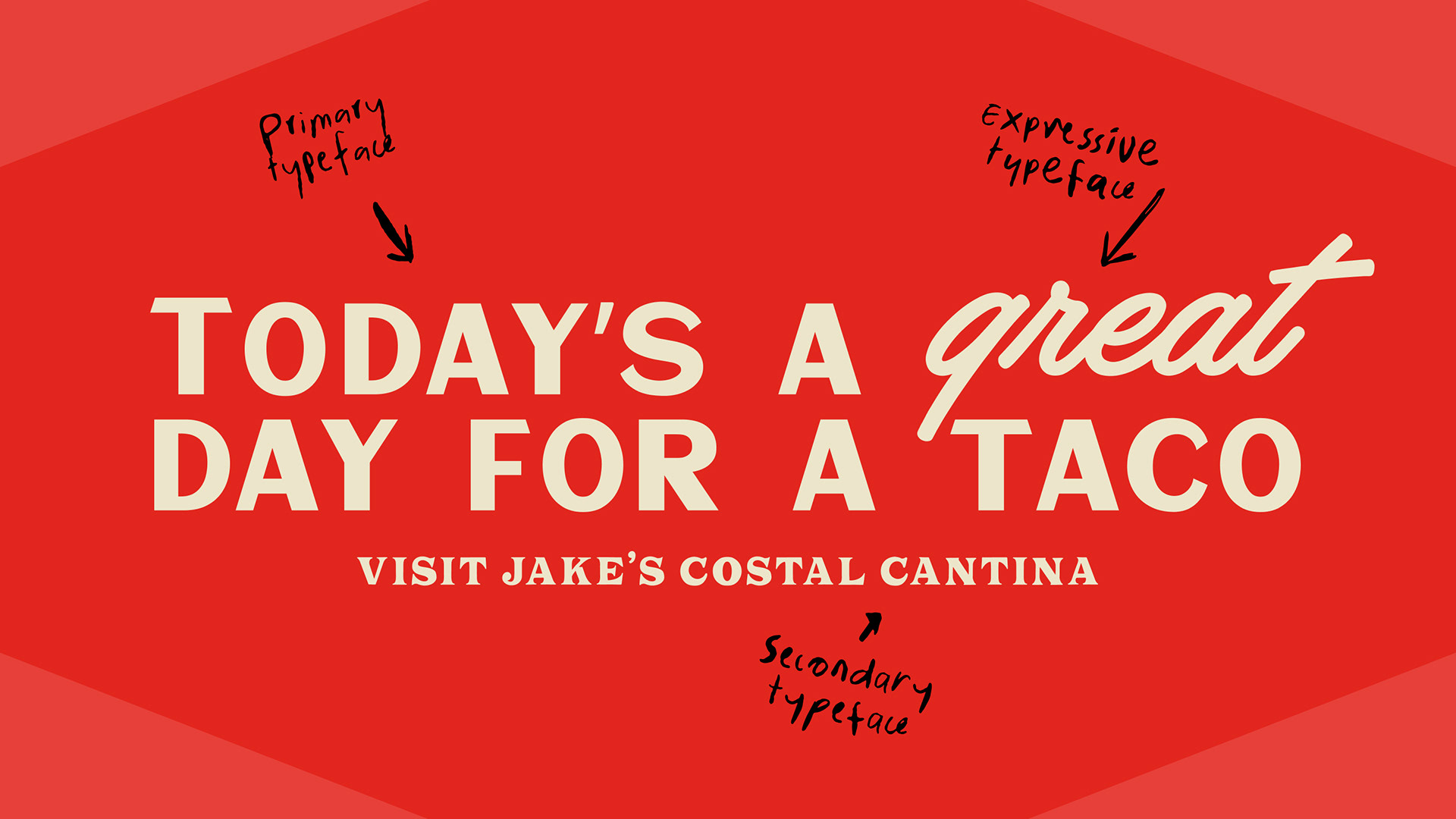
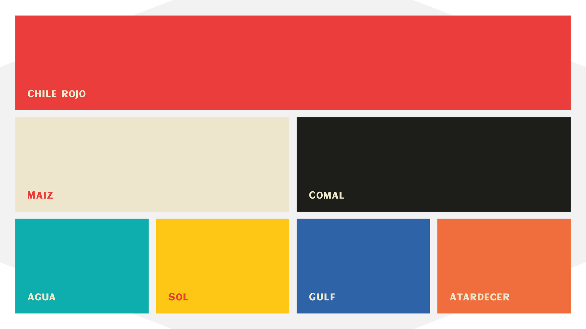
I pulled from hand-painted Mexican signage, taqueria typography and the saturated colors surrounding the food, then mixed that with the sun-faded, slightly imperfect character of Florida’s Gulf Coast.
The goal wasn’t Mexican restaurant plus beach graphics. It was figuring out what Jake’s could look like if those two things had always belonged together.
Tacos need more than a logo.
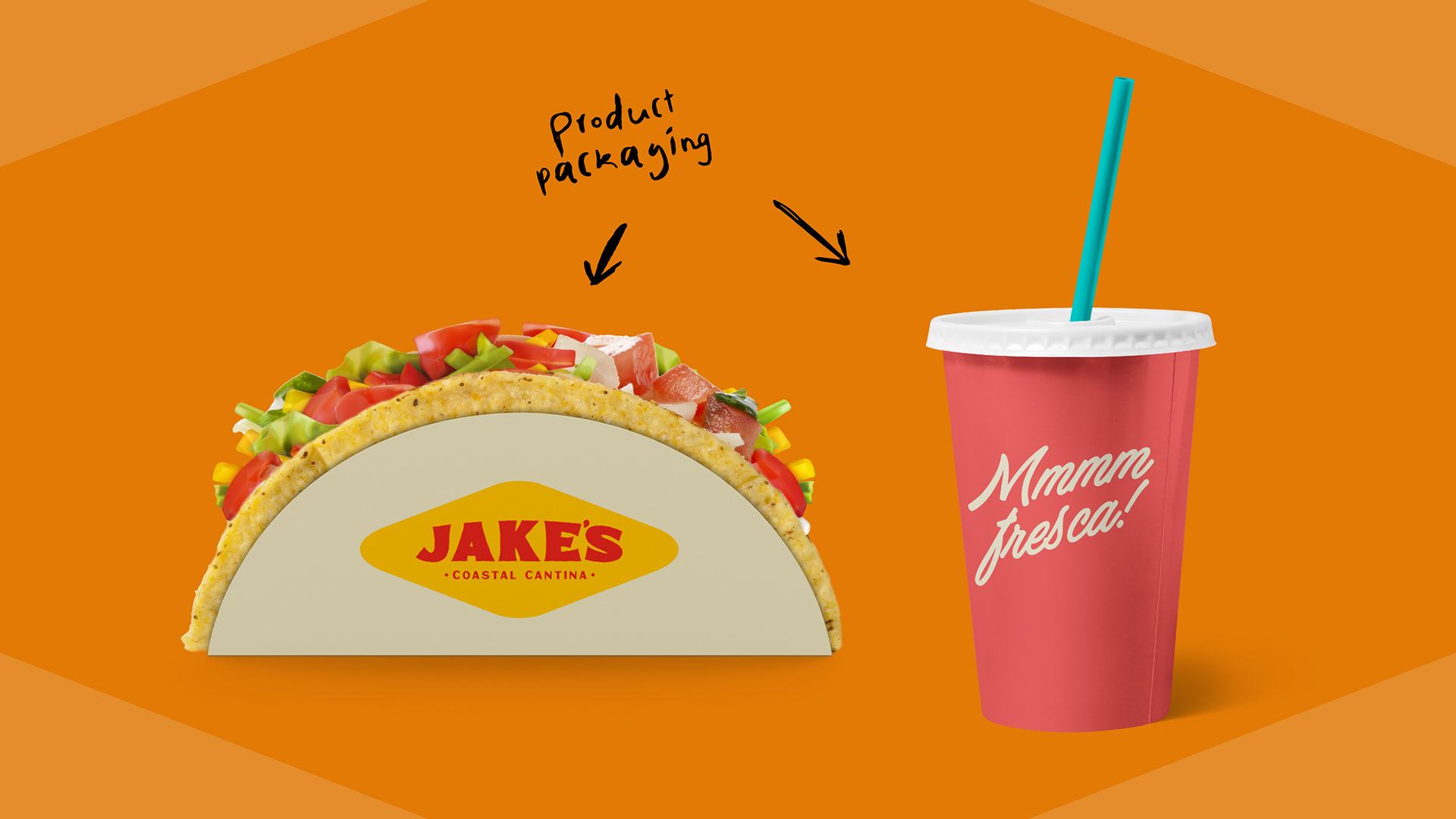
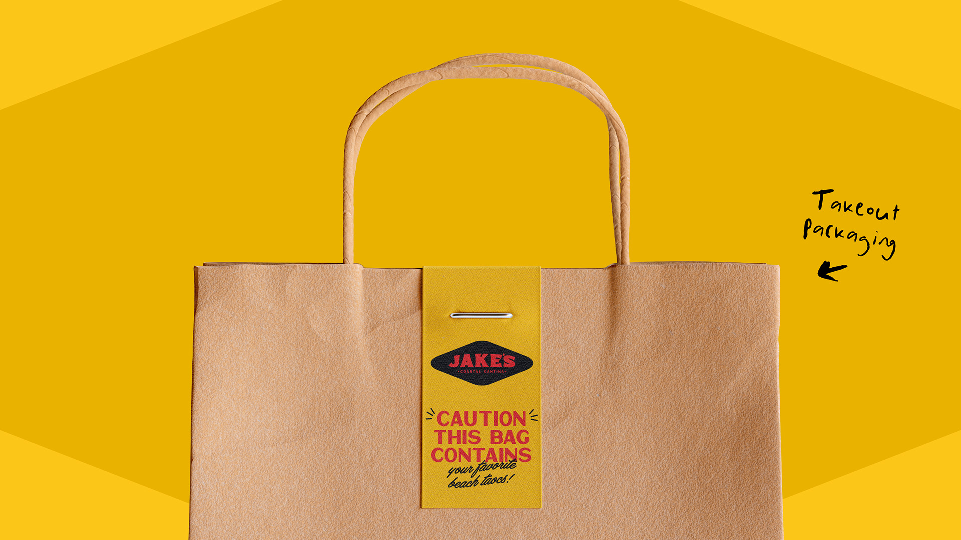
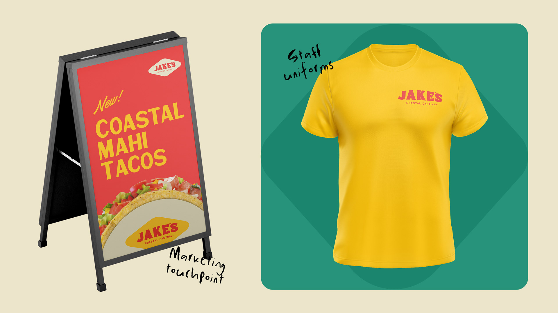
There’s a lot going on at Jake’s: menus, taco wrappers, takeout bags, shirts, sidewalk signs, storefront graphics and roadside advertising. The logo was never going to carry all of that by itself.
So the rest of the system had to do some work too. Type gets big, color gets loud—sometimes obviously, sometimes barely at all.
Making Jake’s look like Jake’s.
Put it all together and Jake’s finally has enough visual language to be recognizable without pasting the logo on everything.
The surfboard is still there. So is the bright, casual personality that made sense for a taco spot by the beach in the first place. The difference is that now those ideas belong to a larger system—one that can stretch from a taco holder to a billboard without losing what made Jake’s feel like Jake’s.